
If you are the type of person that likes to analyse data visually, you should know you can explore the data Wise.blue has to offer in our Dashboard section. The Dashboard template consists of 5 parts:
1. KPI and target gauges
2. Period and trend comparison
3. Campaign table
4. Funnel split analysis
5. Geographical intensity
In order for the dashboard to start visualizing the data you have to choose the date range you wish to analyse. And if there are any specific filters you wish to use, you should apply them to the dashboard.
KPI and target gauges
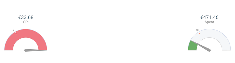
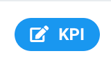
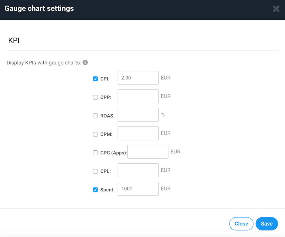
The first part of the dashboard are the KPI and target gauges. You can add up to 5 target gauges to visualize the data. They can be added by using the KPI button at the right top corner of the gauges.
In the KPI selector section you need to provide the targets of each of the KPIs for the gauges to start calculating the actual results.
Period and Trend comparison
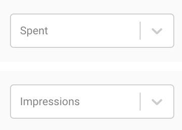
Second part of the dashboard is period and trend comparison. Here from the dropdown you can choose up to two metrics to analyse. These two metrics will be put into period comparison and trend.
Period comparison is split into four parts: Today, Last 7 days, Last 30 days, and All which is the period chosen in the date range in the upper right corner of the Dashboard section.
The trend shows the two chosen metrics in a daily spilt. The amount of days depends on the date range chosen in the upper date range.
Separate campaign analysis
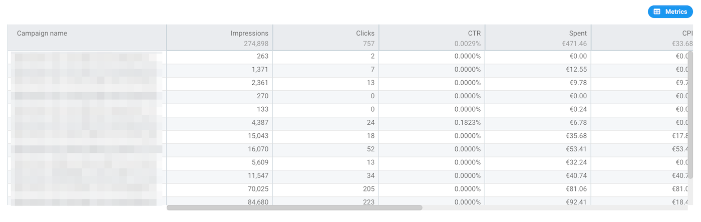
Third part of the dashboard is the campaign table view. In this segment you can analyze specific metrics for each of the campaign that has been active in the filtered time period.
Funnel split analysis
Fourth part of the dashboard are Funnel split analysis. They are split into three parts.
1. Bullet chart
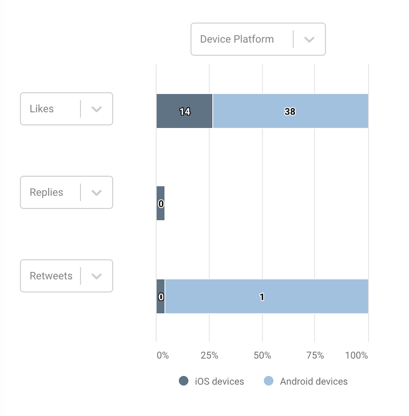
In the Bullet chart you can analyse up to three metrics divided by: device, gender, and age. The bullet chart will show any chosen metric distribution between these three divisions.
2. Funnel chart
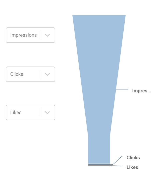
In the funnel chart you can see the visual proportion of up to three metrics you choose. This can help to understand the conversion rates.
3. Intensity table
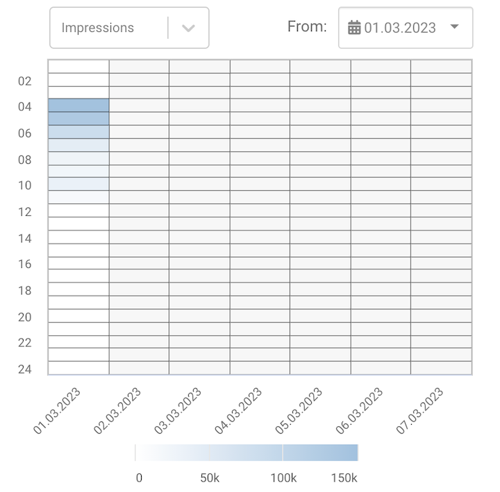
Intensity table shows you 7-day data divided by the time of the day. When a specific metric is chosen, you'll be able to see the at what times there was most traction for the selected metric. You can adjust the 7-day range by using the overall Dashboard section date range in the upper right corner.
Geographical intensity
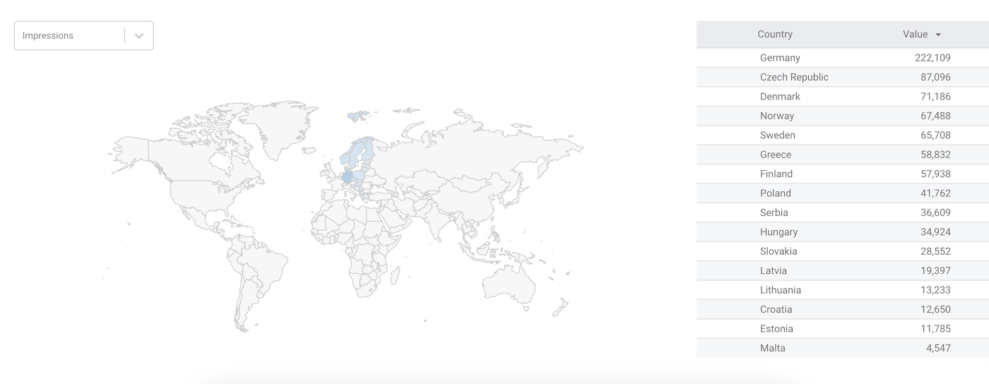
The last part of the dashboards is the Geographical intensity map. In this section you can choose a metric that you wish to analyse by country.